
Shop window: enhance your presentation with effective tips
TL;DR:
- Many retailers only display their most attractive products in the window, but without a targeted approach, this isn't effective. A strong shop window communicates clearly, attracts customers, and enhances brand identity through strategic presentation and appropriate materials. Simple, consistent, and seasonal displays make more impact than cluttered windows with many products.
Many retailers simply put their most attractive products in the window and expect customers to walk in. Unfortunately, that's not how an effective shop window works. In the retail context, a shop window is the visible display at the front of a store that draws passersby's attention to the product range and market segment. There's a big difference between merely displaying products and presenting them with a clear purpose. In this article, you'll learn what exactly makes an effective shop window, common mistakes retailers make, and how you can improve your presentation today.
Table of Contents
- What is a shop window display and why is it important?
- The foundation of a strong shop window: theme, story, and target audience
- Practical tips for immediate impact in your shop window
- Inspiring examples: how successful shop window displays do it
- A fresh perspective: why simple shop windows are often stronger than you think
- Elevate your shop window display immediately
- Frequently asked questions about shop window displays
Key Insights
| Point | Details |
|---|---|
| The shop window is the signboard | Your shop window creates the first impression and draws passersby inside. |
| Work with themes | A clear message and seasonal theme make a shop window more exciting and effective. |
| Simplicity equals strength | A calm, focused presentation sells better than cluttered shop windows. |
| Apply immediately | With practical tips and smart materials, you can quickly make a difference in your shop window. |
What is a shop window display and why is it important?
A shop window display is more than just a store with a pretty window. It's a store that actively uses its front as a sales tool. The word "etalage" comes from the French "étaler," which means "to spread out" or "to display." In practice, it involves a conscious, strategic presentation of products that converts passersby into paying customers.
What makes a shop window display different from a regular store? It's all about intention. As Wikipedia describes, a shop window shows the product range and market segment to potential customers. This means your shop window should communicate at a glance who you are, what you sell, and for whom. Passersby decide whether to enter in an average of three to eight seconds. Your window is, therefore, your fastest sales presentation.
The function of a good shop window is threefold. First, it informs passersby about what you offer. Second, it entices them to enter the store. Third, it strengthens your brand identity. A store that combines these three functions in one consistent presentation performs better than a store that merely puts products in the window.
“A shop window is not decoration. It's your strongest selling point, visible to everyone who passes by.”
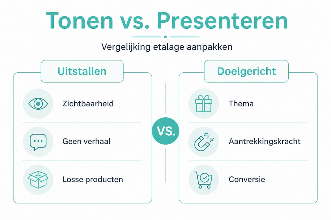
The difference between displaying and purposeful presenting lies in the focus. Displaying is: putting a product down. Presenting is: placing that product in a context that appeals to the customer. See the table below for a clear overview of the difference.
| Feature | Displaying | Purposeful Presenting |
|---|---|---|
| Goal | Show products | Attract and convert customers |
| Theme | Often absent | Clear and consistent |
| Target Audience | Undetermined | Specifically defined |
| Material Use | Arbitrary | Tailored to brand and season |
| Refresh Frequency | Rarely | Regularly (per season or promotion) |
| Result | Limited effect | Measurable customer inflow |
Retailers who consistently work on their shop window notice that customers not only enter more often but also have a more positive image of the brand. For inspiration on the role of must-have retail packaging in a strong presentation.
Now that you know why a shop window is crucial, let's delve into what makes a strong shop window concept.
The foundation of a strong shop window: theme, story, and target audience
A strong shop window starts with a clear message. Visitors should have no questions when they see your window. They should understand at a glance what you offer and whether it's relevant to them. This sounds simple, but in practice, many retailers struggle with choosing a focus.
Shop window experts consistently emphasize that a clear theme and target audience-oriented presentation are at the core of a successful shop window concept. Without that foundation, no creative intervention will work optimally. A theme guides color, material, product selection, and message.
Concrete examples of strong themes for shop window displays include:
- Seasonal themes: spring, summer, autumn, and Christmas provide a clear framework for color and product combinations.
- Holidays: Mother's Day, Valentine's Day, and Sinterklaas offer opportunities for emotional, purposefully presented displays.
- Product launches: a new item deserves its own spotlight, surrounded by supporting products that emphasize its added value.
- Promotions and discounts: a clear call-to-action combined with an attractive display attracts price-conscious shoppers.
- Lifestyle presentations: show products in use, not in isolation. A gift package next to a wrapped product tells a story.
Aligning with your ideal customer is just as important as the theme itself. Ask yourself three questions: who is my customer, what does that customer want, and what does that customer want to feel when they enter my store? The answers determine which colors, materials, and presentation style you choose.
| Target Audience | Style Preference | Color Palette | Material Advice |
|---|---|---|---|
| Young families | Playful, colorful | Primary colors, bright | Kraft paper, colorful ribbons |
| Premium shoppers | Sleek, minimalist | Black, white, gold | Satin ribbon, matte paper |
| Celebration shoppers | Exuberant, festive | Red, green, gold | Curling ribbon, glitter paper |
| Business customers | Professional, neutral | Gray, blue, white | Neutral wrapping paper, plain bow |
A common mistake is that retailers prioritize their own taste over that of their customer. You might like minimalism, but if your customer prefers festive colors, your personal preference will be counterproductive. Always align the shop window with the target audience, not yourself.
Pro-tip: Change your shop window theme at least every four to six weeks. Regular customers will immediately notice something new, which increases the chance they will enter. Always keep the core message clear and avoid the temptation to display too many products at once.
Do you want to know which packaging materials best suit your theme? Color, texture, and material play a big role in this. Read more about the challenges small gift shops face regarding presentation and style.
Now that it's clear how a strong shop window concept is built, let's look at practical tips to apply immediately.
Practical tips for immediate impact in your shop window
You don't need a huge investment to improve your shop window today. Small, targeted adjustments often have the greatest effect. Retailers looking for hands-on training and methodical approaches find that a systematic approach yields much more than sporadic adjustments.
Here are five concrete steps you can take immediately:
-
Determine one central message. Choose one product, one theme, or one promotion to be central. Everything in the shop window supports that choice. Remove anything that distracts from that central message. This is harder than it sounds, but it's the most effective adjustment you can make.
-
Work with varying heights. A flat presentation is boring. Use boxes, pedestals, or stacks to create depth and dynamism. Place the main product at eye level, smaller supporting products lower or higher. Height differences guide the viewer's gaze and make your display more interesting.
-
Use lighting consciously. Daylight is beautiful, but not always sufficient. Add targeted spotlighting to highlight products. Warm light works well for festive or luxurious presentations. Cool white light is better suited for modern or business displays. Poor lighting is one of the most underestimated mistakes in retail presentation.
-
Choose a limited color palette. Use a maximum of three colors in your shop window. More colors create visual chaos and reduce the impact of your display. Choose colors that match your theme and your brand identity. Consistency in color use makes your presentation professional and recognizable.
-
Add a clear call-to-action. Customers need to know what you expect from them. This can be a small sign with an offer, a seasonal message, or an invitation to come inside. Keep the text short and concise. Avoid vague slogans.
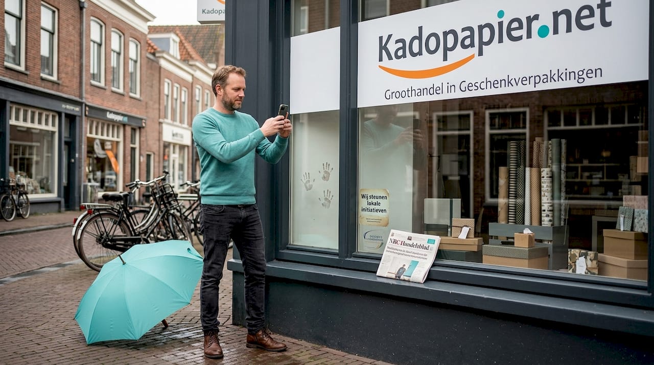
Pro-tip: Photograph your shop window from the street, exactly as a passerby would see it. Critically examine the photo. Is the message immediately clear? Is there too much to see? Is the lighting good? A photo allows you to see your shop window with fresh eyes and reveals areas for improvement you might otherwise miss.
Common mistakes are also worth mentioning. Displaying too many products at once is number one. The idea that more products lead to more sales is incorrect; a limited selection actually makes products more attractive. A second mistake is ignoring the season or current events. A Christmas display in February damages your credibility. A third mistake is using outdated or damaged materials. Wrinkled paper, faded colors, and broken garlands do not inspire confidence.
For practical inspiration on DIY packaging tips that directly contribute to a better presentation, there's plenty to discover. Do you also want to understand how gift packaging can be used for customer experience? You can read more about that in the specific guide.
To apply the insights gained immediately, you'll find inspiring practical examples below.
Inspiring examples: how successful shop window displays do it
Theory is useful. Practical examples are better. Below is an overview of approaches that demonstrably work in real retail situations.
Seasonal shop windows with a sleek color theme
A small gift shop on a busy shopping street works exclusively with seasonal themes and changes its shop window every six weeks. In autumn, a palette of warm orange, deep red, and gold dominates. All packaging materials, from curling ribbon to wrapping paper, align with that palette. The result is a recognizable, inviting ensemble that passersby immediately understand. The store reports that regular customers consciously come to see what's new.
Storytelling in a lifestyle boutique
A lifestyle store presents products not in isolation, but always as part of a scene. A gift is already wrapped under a small decorative tree, surrounded by supporting items such as cards, ribbon, and jewelry. Customers don't just see a product; they see a situation. They recognize the need and are invited to create the same. Small resources are enough here; the creativity in the composition makes the difference.
Creative use of packaging materials as decorative elements
Smart retailers use packaging materials not only for packaging but also as visual elements in the shop window. Rolled kraft paper, fanned tissue paper, and stacked ribbon rolls together form an attractive background screen. This enhances both the appearance and the product message: what you see is what you can buy.
- Use colored tissue paper as a background fill behind products.
- Stack empty gift boxes as pedestals for varying heights.
- Wrap ribbon or curling ribbon around displays for seasonal color.
- Place wrapped products centrally as inspiration for customers.
- Add small decorative accessories such as using lucky charms as playful accents.
Christmas presentations that sell the atmosphere
Around the holidays, competition in shop windows is fiercest. Successful shop window displays then work with layered presentations: a background of winter colors, a middle layer with festive products, and a front layer with attractively wrapped gifts. Tips on Christmas paper in the store show how to create a festive atmosphere with simple means.
What do you learn from these practical cases? First, consistency in color and theme is crucial. Second, showing products in context always works better than presenting products in isolation. Third, packaging materials are not just functional; they are visual communication tools that instantly make your shop window more professional.
After these inspiring practical examples, our sober expert view on shop windows follows.
A fresh perspective: why simple shop windows are often stronger than you think
Here's a thought that surprises many retailers: the most impressive shop windows are rarely the most complex. After years of experience in retail and the packaging industry, it's striking that the tendency to do "more" is actually counterproductive.
Retailers invest time and money in large, busy displays with dozens of products, multiple color schemes, and all sorts of decorative elements. The result indeed looks like "a lot of work." But it doesn't work. The viewer doesn't know where to start, gets overwhelmed, and walks on.
A display window with three products, one color, and one message attracts more attention than a window full of twenty items. This is not an opinion; it is an observation we see time and again with retailers who streamline their presentation. Fewer products mean each product gets more attention. A clear theme means the message comes across directly. Simplicity communicates confidence and professionalism.
This also touches upon a deeper problem we see with challenges small shops face: small retailers try to compensate for a smaller assortment by making everything visible. That is understandable, but counterproductive. Customers don't come in because your window is full. They come in because they recognize something that catches their attention.
There is also a commercial argument for simplicity. When you center one product, you make it easier for customers to make a purchase decision. Decision fatigue is a proven phenomenon. The more options you give a customer, the less likely a choice will be made. A focused display window directs the customer towards one clear action. That is the core of good retail presentation.
The practical lesson is simple: choose less, show better. Invest in the quality of your presentation, not in the quantity of products displayed. Use high-quality packaging materials as a visual element. Ensure good lighting. Change themes regularly. These are the variables that make the difference.
Instantly Elevate Your Store Window
A strong display window starts with the right materials. At Kadopapier.net, you'll find a wide range of packaging and decoration materials that directly contribute to a professional, striking presentation. Add depth and texture to your display with decorative elastic in various colors, perfect for accentuating wrapped products or structuring your display background. Want a luxurious, seasonal look? The emerald curling ribbon immediately gives any presentation a rich, festive appearance. Order Monday to Friday before 3:00 PM, and your order will be shipped the same business day. Shipping is free for orders over €100 excl. VAT.
Frequently Asked Questions about Display Windows
What is the difference between a display window and regular shop presentation?
A display window focuses on attracting customers through a visible, thematic presentation at the front, while regular presentation inside is aimed at clarity and product information. As Wikipedia indicates, the display window shows the assortment and market segment to potential passersby.
How do I quickly create an eye-catching display window without high costs?
By cleverly using theme colors, varying heights, and a clear seasonal theme, you can create a striking display window with minimal resources. Workshops and case studies show that small resources can make a big difference when used strategically.
What common mistakes do you see in display windows?
Too many products, an unclear theme, or poor lighting often make display windows less attractive. A limited product selection with one clear message always works better than an overcrowded presentation without focus.
How do I coordinate packaging materials with my display window?
Choose packaging that matches the theme, target audience, and season for a professional, cohesive look. Materials like ribbon, curling ribbon, and wrapping paper in matching colors immediately enhance the visual coherence of your display window.